Options
Options help you extend Articles by adding extra details and improving pricing flexibility. They are commonly used to define selectable features (e.g. colors, patters, fabrics, special requests) that can affect how an Item is processed or priced.
Use this page to create, edit, organize, and sort both Option groups and Options.
Page Layout
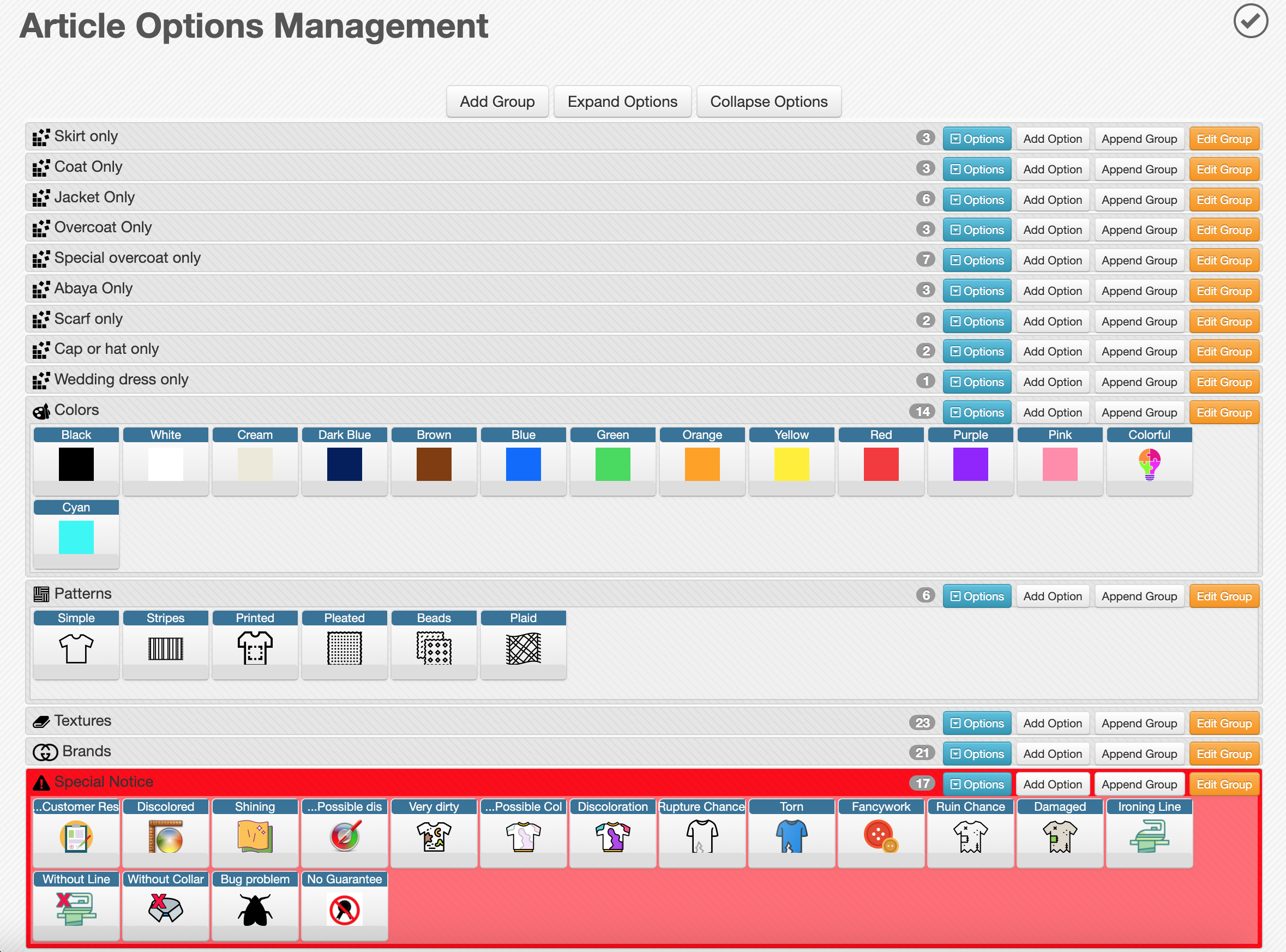
When you open Management > Options, you will see a tree structure (Sorting Tree) of Option Groups.
Options are always organized inside Option Groups, and both can be arranged visually.
- Each row represents an Option Group
- Groups can be reordered or nested using Drag & Drop
- The left side shows the group name and icon
- The right side includes action buttons
Group Row Actions
Each group row contains the following controls:
- Options Expands the group to display its Options as square cards
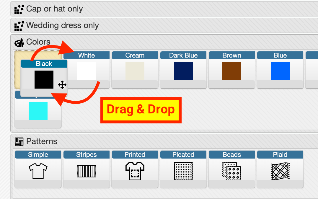
- Options can be reordered via Drag & Drop
- Options can also be moved between groups
- Clicking a card opens the Edit Option form
- Clicking again collapses the list
- Add Option Opens the Add Option form with the current group preselected
- Append Group Creates a new subgroup under the current group
- Edit Group Opens the Edit Group form
Header and Footer Actions
At the top and bottom of the page:
- Add Group → Create a new root group
- Expand Options → Expand all groups
- Collapse Options → Collapse all groups
You can fully reorganize your structure later using Drag & Drop, even if the parent group was initially set differently.
Available Forms
There are two main forms:
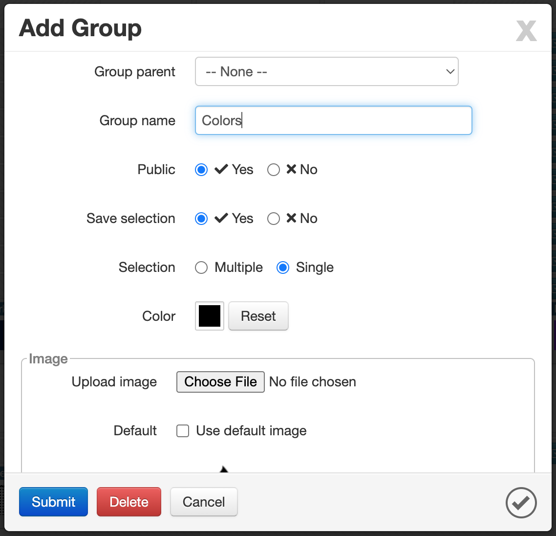
- Add/Edit Group → Main configuration happens here
- Add/Edit Option → Lightweight (name, icon, visibility)
Group Form
Defines the behavior and structure of Options.
- Group ID: Read-only, generated by the system
- Group Parent: Select parent group (leave empty for root level)
- Group Name: The name of the group
- Public:
Yes / NoDetermines if this group is visible during order creation (Drop) - Save Selection:
Yes / NoSaves the last selected options for an Item and auto-applies next time - Selection:
Multiple / Single- Single → only one option can be selected
- Multiple → multiple options can be selected
- Color: Assign a color to visually distinguish this group across the system
- Image: Upload an icon (recommended: flat style)
- You can enable Use default image
Group settings directly impact how users interact with Options during order registration.
Option Form
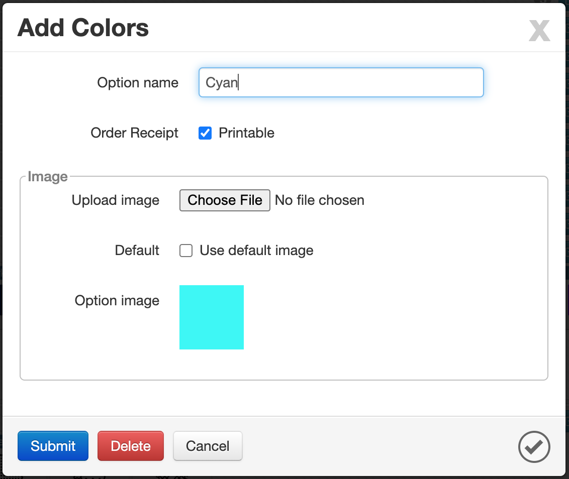
Used to define individual selectable Options.
- Option ID: Read-only, system generated
- Order Receipt:
- Printable: Controls whether the Operation should be shown to the customer in printed output or in the app.
- Image: Upload an icon (recommended: flat style)
- Or enable Use default image
Option forms are intentionally simple — most behavior is controlled at the Group level.
Editing & Deleting
In Edit mode, the form footer includes:
- Submit → Save changes
- Delete → Remove the Option
An Option can only be deleted if it has not been used anywhere in the system.
Recommended Approach (Safe Removal)
If an Option is already in use and cannot be deleted:
- Create a new group with Public = No
- Move unused Options into this group using Drag & Drop
This keeps your system clean without breaking existing data.