Dashboard
The Dashboard page in Caramel gives you a quick accounting overview with summary panels, charts, and recent activity boxes. It can also be used as a lightweight management dashboard for monitoring financial performance and business trends.
The page is designed to help you review key numbers at a glance and then move into the related detail pages when needed.
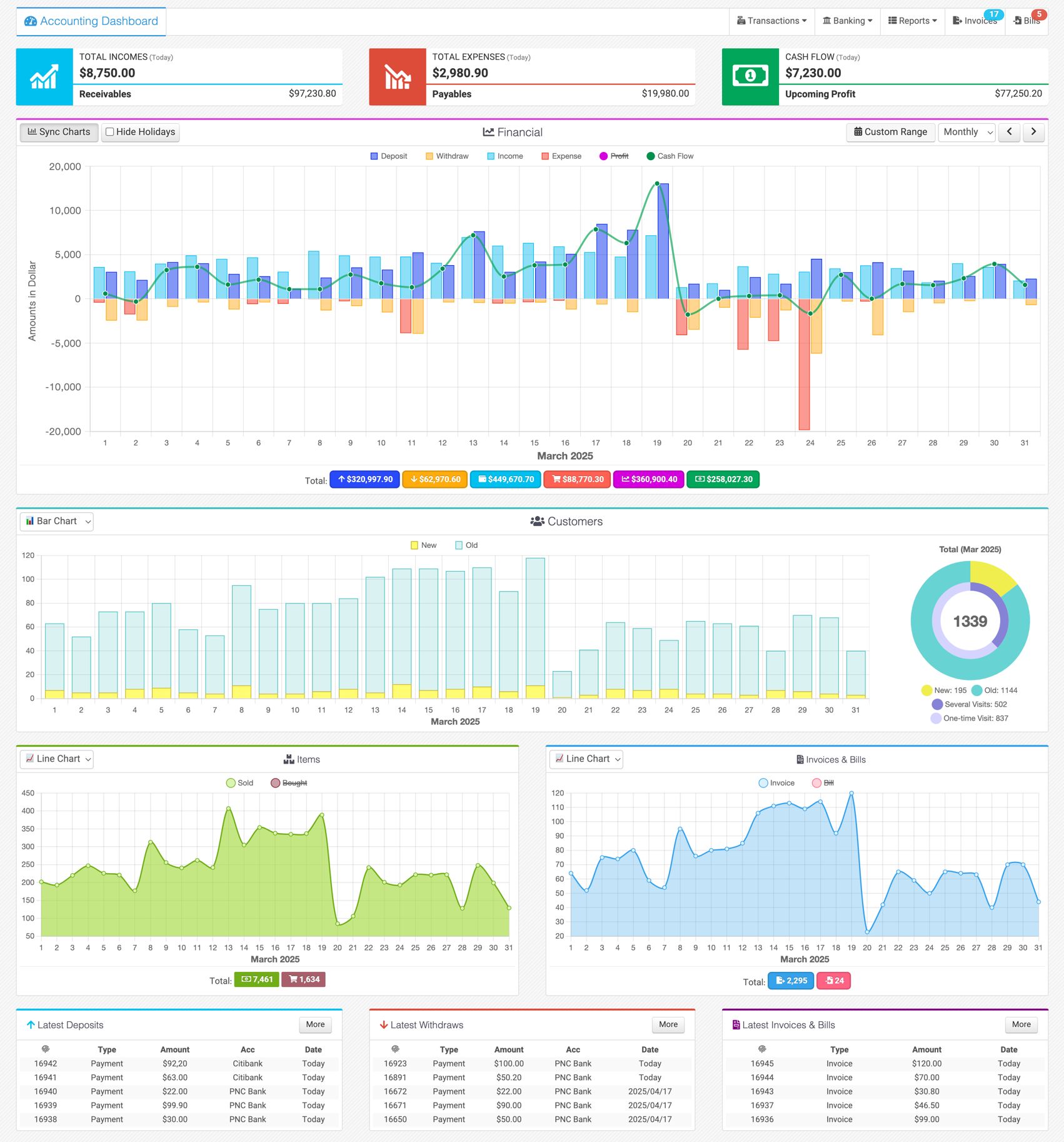
Dashboard Layout
The Dashboard is divided into three main sections:
- Header summary panels
- Charts
- Latest activity boxes
At the top of the page, three summary panels show the most important high-level values:
- Total Income
- Total Expense
- Cash Flow
The middle section contains four charts:
- Financial
- Customers
- Items
- Invoices & Bills
At the bottom of the page, three boxes show the latest related records:
- Latest Deposits
- Latest Withdraws
- Latest Invoices & Bills
Header Summary Panels
The top section includes three colored summary panels:
- TOTAL INCOME
- TOTAL EXPENSE
- CASH FLOW
By default, these panels are usually set to Today, so they show today's values. Depending on your Caramel setup, the default range can also be changed to periods such as:
- This Month
- This Year
- This Season
The default date range of the header panels can be configured during setup, depending on how your business wants to monitor financial activity.
Clicking the large icon in each panel opens the related detail page filtered for the same date range, so you can review the underlying records.
Total Income Panel
The Total Income panel shows the total income amount for the selected period.
At the bottom of the panel, you will also see Receivables.
When you hover over Receivables, more details become visible, including:
- Receivables (Overdue)
- Receivables (Open)
- Unused Credit
Unused Credit is a negative value and is deducted from the two receivable values above to calculate the final receivables amount.
Both Receivables and its detailed values are clickable. They open the Invoices page with the matching date filter so you can review the related records.
Total Expense Panel
The Total Expense panel shows the total expense amount for the selected period.
At the bottom of the panel, you will see Payables.
When you hover over Payables, more details are shown:
- Payables (Overdue)
- Payables (Open)
- Unused Credit
As in the income panel, Unused Credit is a negative value and is deducted from the payable values to calculate the final payable amount.
Both Payables and the detailed values are clickable. They open the Bills page with the related date filter so you can review the details.
Cash Flow Panel
The Cash Flow panel shows the difference between Deposits and Withdraws for the selected period.
At the bottom of the panel, Upcoming Cash Flow is also shown. This value is based on the difference between Receivables and Payables from the two previous panels.
This gives you a quick view of both current cash movement and expected short-term cash position.
Charts Section
The Dashboard currently includes four charts:
- Financial
- Customers
- Items
- Invoices & Bills
In all charts:
- the X-axis represents time
- the Y-axis represents values or counts
The default chart range is usually Monthly, which means the chart displays the current month and each point on the X-axis represents a day in that month.
This default can be changed for each chart in the module configuration.
Shared Chart Controls
All four charts follow a similar layout and include similar controls.
Chart Header
On the left side of each chart header, you can find:
- a dropdown for switching between 📈 Line Chart and 📊 Bar Chart
- the Hide Holidays button
When Hide Holidays enabled, days with no recorded activity (holidays or non-business days) are hidden from the chart to provide a cleaner view of your actual data.
On the right side of each chart header, you can change the chart time range using:
- a dropdown for:
- Daily
- Weekly
- Monthly
- Quarterly
- Yearly
- Decadal
- a previous button with
- a next button with
- a Custom Range button with
These controls let you move through time and analyze the chart in the range that fits your review.
Chart Legends
Above the chart area, legends are displayed for the available data series.
You can click a legend to temporarily hide or show that series. This is useful when you want to focus on only part of the chart.
Chart Tooltip
When you move the mouse over the chart area, a tooltip shows the values for the date currently under the pointer.
This helps you inspect exact values without leaving the chart.
Chart Footers and Totals
All charts include summary values in the footer.
These totals show the combined value of the chart data for the selected range, and in most cases they are also clickable so you can open the related detail page.
There are a few exceptions:
- In Financial, footer totals are clickable
- In Invoices & Bills, footer totals are clickable
- In Items, totals are shown but are not clickable
- In Customers, totals are shown as a Doughnut chart instead of standard footer totals, and those values are clickable
Sync Charts
The Sync Charts button appears only in the first chart, which is the Financial chart.
When enabled, all four charts become synchronized. This means:
- changing the period type in the Financial chart also changes the other charts
- moving to the previous or next range also updates the other charts
- the selected time scale becomes shared across all charts
This is useful when you want to compare all dashboard charts over exactly the same timeline.
Financial Chart
The Financial chart is the main accounting chart on the Dashboard, and its data comes from Transactions.
It displays:
- Income
- Expense
- Deposit
- Withdraw
These are typically shown as bar series.
It also displays:
- Profit = Income - Expense
- Cash Flow = Deposit - Withdraw
These are typically shown as line series.
This combination makes it easier to compare operational results and cash movement in one place.
Financial Chart Interaction
Like the other charts, hovering over the chart shows a tooltip for each date.
The Financial chart also has one additional interaction:
When you right-click on a date, the tooltip becomes fixed and changes to a cream-colored state. In that mode, the displayed values become clickable.
This lets you jump directly to Transactions for the selected date and review the detailed entries behind that point.
Use the Financial chart when you want to move from a visual trend into transaction-level analysis.
Customers Chart
The Customers chart has two parts.
Left Side
The left side takes most of the chart width and behaves like the other dashboard charts.
It displays customer counts such as:
- New
- Old
Right Side
On the right side, the total values are shown as a two-ring Doughnut chart.
- The outer ring shows the total of New and Old
- The inner ring shows the total of One-Time Visit and Several Visits
These values are based on the selected date range.
This layout helps you review both trend data and customer composition at the same time.
Items Chart
The Items chart shows two main values:
- Sold
- Bought
These represent sold and purchased Items in the selected period.
When you hover over the chart, the tooltip shows not only the total Sold and Bought counts, but also their breakdown by type, including:
- Product
- Service
This makes the chart useful when you want a quick operational view of item movement without opening a separate report.
Invoices & Bills Chart
The Invoices & Bills chart shows document counts for the selected period.
It includes:
- Invoice for sales invoices
- Bill for purchase bills
This chart is useful for reviewing how many accounting documents were created over time and spotting document activity trends.
Latest Activity Boxes
At the bottom of the Dashboard, three boxes show recent activity:
- Latest Deposits
- Latest Withdraws
- Latest Invoices & Bills
By default, each box usually shows the last 5 records.
Each box header includes a More button. Clicking More opens the related page so you can review additional records.
In practice, these buttons take you to the related transaction or document list depending on the selected box.
Notes
The exact defaults, chart behavior, visible totals, and available filters may vary depending on your Caramel configuration and setup.
A common workflow is to start from the Dashboard, identify an unusual value or trend, and then open the related detail page from the panel, chart total, tooltip, or More button.